Visualisation illustration


This is a concept artwork done for visualising a space- a baker's home, for our batch's claymation film.
It's hand drawn and digitally coloured.
The film is in it's post production stage and should come out soon! :-)


Sound Design- Assigning Foley to video


Do use headphones/speakers! :)


This is a stock video that was given to us during our Sound Design Module. It had no sound. Three of us ( Aakanksha, Esha and myself) planned, recorded, and syncd the sound to the video. The presentation has been done in a manner in which we have tried to show the step by step progression of the process, culminating in the final result.


Special thanks to our guide Dhiman Sengupta.

Basic Animation mini-clip!


This is a small animated clip I made during my 2nd year at NID. It aimed to sum up all the animation we learnt during the course of one year.
We were given a verbal brief and were asked to visualise the entire thing ourselves and make individual interpretations of the brief.
Special thanks to our guide Sekhar Mukherjee for helping us pull it off!
Adding a soundtrack to this and colouring it is a part of my (work)to-do list! :-)

Short Film! :)


ALL YOU NEED TO MAKE A FILM IS A GIRL AND A GUN

This is a short film which 2 of my batchmates (Rabindra and Neer) and myself made during our 5th Semester at NID, Ahmedabad.

It is about three friends who in frustration, go out to make a film in the city of Ahmedabad. We decided to cast ourselves in the film! :-)
The entire film- from script to screen has been made in 4 nights and 3 days!
Do stay till the end credits roll for a surprise! :)

RGB : The Big Stage


Illustrated Posters!


These are some explorations for a poster I made for NID's annual design fest RGB 2012.
The event I made it for was called The Big Stage, where participants had to speak about their work as students in front of a panel from the industry. If they were impressive, they would get hired as interns! :)
So I took this scenario and depicted a series of coolies trying to lure customers by showing off in innovative ways! :)

The point to put all the explorations up is to show the difference that comes between each with a mere change of color and composition. The last one was what finally was taken ahead to put the information.

Poster for Sandhya's fiction


Sandhya's fiction film :

My friend Sandhya Ramachandran is a Post Graduate student of Film and Video Communication at NID. She had adopted a Ruskin Bond story, and put some wonderful visuals- resulting in a beautiful film.

This is a scan of a small but detailed handmade poster I made for her film screening.
Mediums used : Rotoring pen, watercolour, black marker and white pen!

My-crow Thinking

"My-crow Thinking" is my friend Harish's brainchild. It revolves around the concept of simple thinking, taking crows as the inspiration. This is used effectively to communicate some ridiculous things we humans sometimes do (including myself)! I am working on a set of illustrations for this initiative. This is one of them.

You can check out the group here here . 


Early Digital Sketches

Some early Wacom sketches at home...

(Reference taken for the second image)


Newspaper characters


In the shoes of...


Some Character sketches and illustrations I had done trying to step into the shoes of a newspaper cartoonist who runs a comic strip..... Wanted to explore how work would come out if done in super speed!
Why did I do this? Just like that! :)

Marry Christmas!


A little late but an illustration I made in, well, December!

Two posters and a story

My first not quite successful shot at Bollywood!

So I get in touch with somebody(via a Facebook post) wanting some posters designed, to be used in Madhur Bhandarkar's upcoming film "Heroine" (!) He tells me - "You have two hours to come up with a poster design for two dummy films to be used within the film."
I could use reference/stock images and make these posters-

The first being ANNIE - an indie film(that was the only information provided). Below is my rendition!

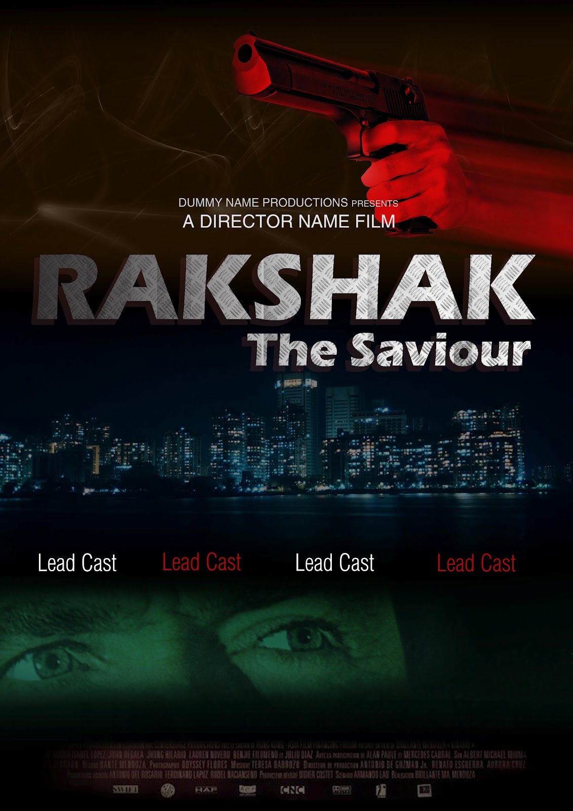
The second being RAKSHAK-THE SAVIOUR - An action film! Below is my interpretation.

Well, he liked both, BUT told me the Annie poster should be more creepy. The Rakshak poster should be more like Wanted, Agent Vinod, etc. One star's face in the poster!

Oh, and he asked for more "textures" on both. Well, reflecting back, I agree, I should've seen that coming. 
This has helped me in approaching my work in a way where I try and predict the client's need- works sometimes, sometimes doesn't!

He said he would get back to me and hasn't yet. So I guess that's the end of that small but memorable experience. :-)


Micromax logo Re-design


This is an entry for a logo re-design competition by Micromax

In an attempt to keep it simple and universal, the logo has been designed keeping a bouncing ball in mind. The sheer action displays energy and dynamism.
The arcs of the "M" are formed by the path of the ball. The second arc being bigger than the first symbolize growth/youth.
There are two color options - one with gradient, one without.
The tag line "Nothing like Anything" has been incorporated within the logo.

Perfectionist Friend


This is an entry for a competition by Airtel.

Going with the current branding, I attempted a title of "Perfectionist Friend".
The video shows a friend trying to cut the PERFECT PAPER CIRCLE with a pair of scissors, oblivious to anything around him.
After watching the reference video on the Airtel page, I have presented the video in the standard format that was found common- with the title and the brand coming at the end.
The duration is exactly one minute : including credits.